Design
As the client didn't have any web presence prior to the establishment of the site,
complete branding, including logo design, was undertaken. We first tried to understand the
image and tone of voice that the site should present. Being a personal trainer, it should be bold and
energetic, trustworthy, knowledgeable yet friendly.
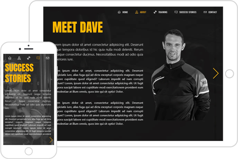
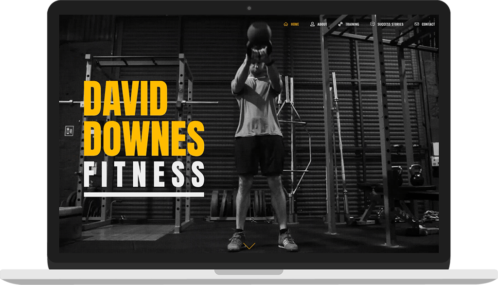
Thus the choice of a strong primary color along with a bold, square, and sturdy display font, combined with a softer, rounder typeface for
copy, all set against monochromatic images and dark backgrounds.
The choice of yellow for the primary accent color was made to invoke that feeling of vitality and energy. The varying shades of dark and light greys
were chosen to allow the yellow to pop. And a counterpoint of very light grey maintains that sense of lightness and energy, while playing well with
the visual style of the site.
The monochromatic images and background video were chosen partly because it works visually,
lending a sense of cool, integrity, and general visual consistency. But the choice was also somewhat pragmatic as the
quality of the images provided, namely from the clients' own photographs, varied widely.